
.png)
TL;DR:
- Visual pollution involves man-made elements that degrade environmental aesthetics and impacts urban well-being. Professionals utilize data-driven visuals and advanced spatial analysis to assess and mitigate these effects, despite regulatory gaps. Addressing visual pollution through policy, green infrastructure, and community engagement enhances environmental quality and ESG performance.
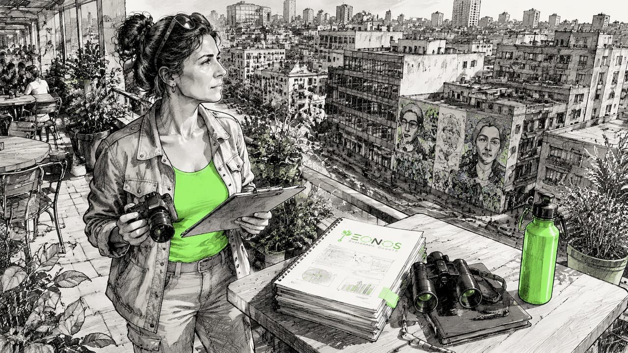
A pollution visual is any data-driven representation, map, image, or chart that translates environmental contamination data into a form humans can interpret, compare, and act on. For environmental professionals, educators, and activists, these visuals are not decorative. They are the primary evidence layer in advocacy, compliance reporting, and policy design. Tools like IQAir’s live air quality maps, NASA’s aerosol satellite imagery, and GIS-based contamination models have made it possible to see pollution at scales and resolutions that raw data tables never could. Visual pollution itself is defined as the presence of unattractive man-made elements, including billboards, overhead wires, graffiti, and poorly maintained structures, that degrade the aesthetic quality of an environment and compound other pollution effects.
1. What is visual pollution and why does it matter for professionals?
Visual pollution is defined as the accumulation of man-made elements that degrade the aesthetic quality of a landscape or urban environment. It is not a soft concept. Researchers measure it with structured indicator frameworks, GIS spatial tools, and quantified scoring systems. The impact of visual pollution extends beyond aesthetics. It correlates with psychological stress, reduced property values, diminished biodiversity perception, and weakened public trust in urban governance.
For environmental professionals, the challenge is that visual pollution sits at the intersection of urban planning, public health, and environmental law. Most jurisdictions lack comprehensive legislation on visual pollution, relying instead on fragmented local ordinances. That regulatory gap means professionals must build their own assessment frameworks rather than follow a single standard.
2. Top categories of pollution visuals for air, water, and land
Pollution visuals divide into three primary categories, each with distinct data sources, formats, and professional applications.
Air pollution visuals
- Real-time AQI heatmaps from platforms like IQAir and PurpleAir show particulate matter concentrations across cities and regions.
- Satellite aerosol optical depth imagery from NASA MODIS and Sentinel-5P captures pollution plumes at continental scale.
- Time-lapse smog photography documents seasonal and industrial pollution cycles in cities like Beijing, Delhi, and Los Angeles.
Water pollution visuals
- Contamination concentration maps use sensor data and remote sensing to show nitrate, phosphate, and heavy metal distribution in river systems.
- Ocean color imagery from Copernicus Marine Service identifies algal blooms, sediment plumes, and oil spill boundaries.
- Pollution source tracing maps overlay industrial discharge permits with downstream contamination readings to establish causality.
Land and visual pollution visuals
- Waste distribution maps generated through GIS show illegal dumping density across urban and peri-urban zones.
- Satellite land use change analysis from platforms like Google Earth Engine tracks deforestation, soil sealing, and urban sprawl over time.
- Visual assessments of urban clutter document signage density, unfinished construction, and green space absence in structured surveys.
Pro Tip: Combining satellite remote sensing data with ground-level sensor readings produces significantly more accurate pollution visuals than either source alone. NASA’s EarthData portal and the European Environment Agency’s data hub both offer free, publication-grade datasets for this purpose.
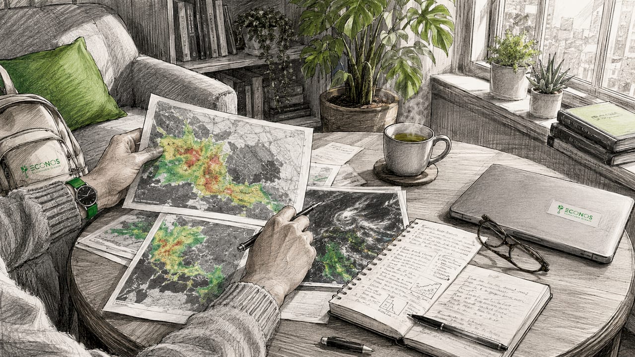
3. How spatial techniques improve visual pollution assessment
Spatial analysis converts subjective visual observations into quantifiable, mappable data. Two methods dominate current research practice: the Analytic Hierarchy Process (AHP) and Weighted Linear Combination (WLC).
AHP assigns relative importance weights to different visual pollution criteria, such as signage density, green space coverage, and structural disrepair. WLC then combines those weighted layers into a single composite map. A recent study on Golestan National Park applied both methods across 12 positive and 3 negative criteria to produce a landscape aesthetic valuation map. The result showed that areas with “high” aesthetic value covered only around 20% of the park’s recreational zones. That finding directly informs park management decisions about where to restrict development and where to invest in restoration.
A critical technical advance in this field is fuzzified mapping. Standard GIS buffers treat visibility as binary: you either see a structure or you do not. Fuzzified techniques incorporate elevation data and line-of-sight modeling to produce graduated visibility scores. This approach outperforms simple distance buffers and produces more defensible results in regulatory and planning contexts.
Key elements that strengthen any spatial visual pollution assessment:
- Elevation-based viewshed analysis to model what is actually visible from key observation points
- Connectivity integration to identify which zones have the highest pedestrian or traffic exposure to visual pollution sources
- Fuzzified data layers to translate qualitative survey responses into GIS-compatible numerical scores
- Multi-source data fusion combining public perception surveys with objective spatial metrics
Pro Tip: Applying Space Syntax connectivity analysis alongside visual pollution scoring identifies true hotspots. High connectivity plus poor maintenance predicts the zones where visual pollution causes the most psychological and aesthetic damage.
4. Metrics and tools for measuring visual pollution effects
The Visual Pollution Index (VPI) is the most widely referenced quantification tool in urban environmental assessment. The VPI incorporates signage density, green space absence, and structural condition factors to produce a composite score that urban planners can map and track over time. It draws on both aerial imagery and ground-level survey data, making it applicable across scales from a single street to an entire district.
The table below compares the primary tools and methods professionals use to assess visual pollution, along with their data requirements and best-fit contexts.
| Tool or method | Primary data source | Best-fit context | Key limitation |
|---|---|---|---|
| Visual Pollution Index (VPI) | Aerial imagery, ground surveys | Urban planning, city audits | Requires consistent survey protocols |
| AHP + WLC spatial model | GIS layers, expert weighting | Natural parks, landscape planning | Subjective weight assignment |
| Fuzzified viewshed mapping | DEM elevation data, GIS | Scenic corridor protection | High data processing demand |
| Structured indicator surveys | Field observation, scoring sheets | Neighborhood-level audits | Labor intensive at scale |
| Satellite land use analysis | Sentinel, Landsat, MODIS | Regional and national monitoring | Low resolution for local detail |
Each method has a different cost-accuracy tradeoff. For city-level compliance reporting, the VPI combined with GIS aerial analysis offers the best balance. For protected natural areas, AHP-WLC with fuzzified viewshed layers produces the most defensible scientific output.
5. Visual pollution hotspots revealed by recent data
Recent field studies have produced concrete, mappable evidence of where visual pollution concentrates and why. These findings give professionals a benchmark for their own assessments.
- Informal settlements in Bou Saâda, Algeria, recorded the highest visual pollution scores at 36%, outpacing both colonial-era and planned residential districts. The study used 275 indicators rated on a 0–5 scale, totaling 1,975 scored points. Lack of green space was the single most impactful factor at 14.03%.
- Golestan National Park in Iran showed that visual pollution from tourism infrastructure and uncontrolled signage has reduced high-aesthetic-value zones to roughly 20% of recreational areas. This is a direct argument for spatial zoning controls in protected landscapes.
- Urban hotspots of visual pollution consistently emerge in highly connected but poorly maintained zones rather than in isolated derelict sites. High foot traffic amplifies the psychological and aesthetic impact of visual clutter, making central commercial corridors disproportionately damaging.
- Signage proliferation in unregulated commercial strips across cities in Southeast Asia, North Africa, and Eastern Europe follows a predictable pattern: density increases near transit nodes and market areas, exactly where visual exposure is highest.
- Statistical correlations between visual pollution components often exceed r=0.80. This means that improving one element, such as adding green space, produces cascading improvements across multiple indicators. Targeted interventions deliver outsized returns.
6. Ways to reduce visual pollution through policy and design
Reducing visual pollution requires coordinated action across regulatory, design, and community channels. The evidence base now supports specific, testable approaches rather than general aesthetic guidelines.
Regulatory controls are the most direct lever. Signage ordinances that cap billboard size, limit illuminated advertising near residential zones, and require permits for exterior modifications have measurable effects on VPI scores. São Paulo’s Clean City Law, enacted in 2007, removed over 15,000 billboards and is the most cited large-scale example of regulatory visual pollution reduction in urban planning literature.
Green infrastructure investment addresses the single most impactful visual pollution factor identified in the Bou Saâda study: green space absence. Street tree programs, pocket parks, and mandatory green setbacks in building codes all reduce VPI scores. They also deliver co-benefits for air quality, urban heat, and mental health, making them high-return investments for city sustainability budgets.
Design standards for informal settlements represent the hardest but most necessary intervention. Informal housing zones consistently score highest on visual pollution indices. Programs that provide facade improvement grants, standardize utility routing, and support community-led beautification have reduced visual pollution scores in pilot projects across Latin America and North Africa.
Visual pollution awareness campaigns that engage residents in scoring and mapping their own neighborhoods build the public pressure needed to sustain regulatory action. Participatory GIS tools now make it possible for non-specialists to contribute structured data to professional assessments.
7. Examples of visual pollution in urban and natural settings
Understanding what visual pollution looks like in practice helps professionals calibrate their assessments and communicate findings to non-specialist audiences.
In urban settings, the clearest examples of visual pollution include:
- Unregulated billboard clusters near highway interchanges, where competing advertisers stack signage until the visual environment becomes incoherent
- Overhead utility wires in older city districts, which research consistently identifies as a high-impact visual pollution source because they fragment skylines and signal infrastructure neglect
- Unfinished or abandoned buildings with exposed rebar, unpainted facades, and broken windows, which score high on structural disrepair indicators in VPI assessments
- Graffiti in non-designated zones, which differs from commissioned street art in that it signals lack of maintenance and ownership rather than creative investment
In natural settings, visual pollution takes different forms. Tourism signage that exceeds landscape scale, parking infrastructure visible from scenic viewpoints, and power line corridors cutting through forested areas all reduce aesthetic value scores in AHP-based assessments. The Golestan National Park study is the clearest documented case of how tourism development, without visual impact controls, degrades the very landscapes it depends on.
Pro Tip: When building a visual pollution awareness presentation for policymakers, pair before-and-after satellite imagery with VPI score changes. The combination of visual evidence and quantified data is far more persuasive than either alone.
Key takeaways
Visual pollution is a measurable, mappable environmental problem that requires the same scientific rigor and regulatory attention as air, water, and land contamination.
| Point | Details |
|---|---|
| Visual pollution is quantifiable | The VPI and AHP-WLC methods convert subjective observations into defensible, mappable scores. |
| Informal settlements score highest | Bou Saâda data shows informal zones reach 36% visual pollution intensity, driven by green space absence. |
| Spatial techniques outperform buffers | Fuzzified viewshed mapping with elevation data produces more accurate assessments than distance-based methods. |
| High connectivity amplifies impact | Hotspots form where urban connectivity is high and maintenance is low, not in isolated derelict areas. |
| Regulation remains fragmented | Most jurisdictions lack comprehensive visual pollution law, requiring professionals to build their own frameworks. |
Why visual pollution deserves a place in your ESG strategy
I will be direct: visual pollution is the environmental issue that most ESG frameworks still treat as a footnote. When I work with companies on their environmental reporting, the conversation almost always centers on carbon, water, and waste. Visual pollution rarely appears on the materiality matrix, even for companies whose operations directly shape the built environment.
That is a mistake, and the data now makes it harder to defend. The structural interconnection between visual pollution components means that companies ignoring facade quality, signage management, or green space provision around their facilities are likely underreporting their full environmental footprint. The cascading correlations above r=0.80 between visual pollution indicators tell us that neglect compounds. One unfinished building, one overgrown lot, one unregulated sign cluster does not stay isolated. It signals to the surrounding environment that maintenance standards are low, and the neighborhood responds accordingly.
The regulatory gap is real. Most jurisdictions have not enacted comprehensive visual pollution law. But that gap is closing, and companies that wait for regulation to force action will find themselves behind peers who treated visual quality as a legitimate environmental metric years earlier.
My honest recommendation: add a visual pollution assessment to your next site audit. Use the VPI framework, document your baseline, and set a three-year improvement target. It is not a complex exercise. It is a credible one. And credibility, in ESG reporting, is the asset that compounds.
— Mathieu
How Econos-esg supports data-driven environmental assessment

Environmental professionals need more than good data. They need frameworks that connect pollution measurement to compliance obligations and business decisions. Econos-esg builds exactly that capacity for mid-size and large companies across Romania, France, and Vietnam. From carbon footprint assessment that maps Scope 1, 2, and 3 emissions to ESG reporting aligned with CSRD and ESRS standards, Econos-esg translates environmental data into structured, auditable outputs. If your organization is ready to move from awareness to accountability, the Econos-esg team and AVA, our AI-powered carbon accounting assistant, are built to help you get there without creating consultant dependency.
FAQ
What is visual pollution?
Visual pollution is the presence of unattractive man-made elements, including billboards, overhead wires, graffiti, and poorly maintained buildings, that degrade the aesthetic quality of an environment. It is measurable using structured indicator frameworks and GIS spatial tools.
What are the main effects of visual pollution?
The impact of visual pollution includes psychological stress, reduced landscape aesthetic value, lower property values, and weakened public trust in urban governance. Research in Golestan National Park shows that visual pollution reduces high-aesthetic-value areas to roughly 20% of recreational zones.
How is visual pollution measured?
The Visual Pollution Index (VPI) combines aerial imagery and ground survey data to score signage density, green space absence, and structural condition. Spatial methods like AHP and WLC add weighted GIS layers to produce composite assessment maps.
What are the most effective ways to reduce visual pollution?
The most documented ways to reduce visual pollution include signage ordinances, green infrastructure investment, and facade improvement programs in informal settlements. São Paulo’s Clean City Law removed over 15,000 billboards and remains the benchmark large-scale intervention.
Why do most cities still struggle with visual pollution regulation?
Most jurisdictions rely on fragmented rules rather than comprehensive visual pollution legislation, which limits coordinated enforcement. This regulatory gap forces environmental professionals to develop their own assessment and reporting frameworks.